The Art of Shares Turns Stock Market Numbers into 3D Vizualizations and Prints

IG, a British online trading provider, presents "The Art of Shares", an interactive way to visualize share prices, turning them into 3D sculptures which resemble skyscrapers. They even 3D printed a few too.
Share prices aren’t the most interesting things to look at, but the UK-based online trading provider, IG, has come up with a way to make them more exciting: Creating 3D sculptures from numbers.
The interactive data visualization is called The Art of Shares and the company claims this work can help give insight into the factors influencing stock market performance, including companies like Tesla.
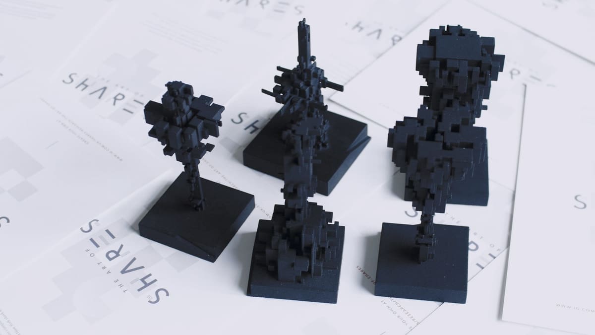
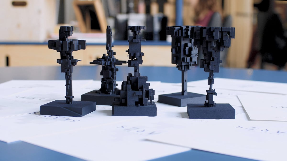
Dave Ellis is behind the work and didn’t stop at creating sculptures, he even used a 3D printer to bring a few to life.
“The Art of Shares’ is a rich, innovative experience which generates interactive sculptures from stock market data,” he said in a press release. “The algorithm takes actual share-price data from an API, which in turn generates a sculpture to represent the share price over time. This enables users to explore, visualize and compare share-price data in a way that’s never been possible before.”
Creating Art from Stock Market Data
Although it makes cool sculptures, the 3D modeling tool is a response from IG to their trader’s “thirst for knowledge” when it comes to the stories behind a particular brand’s performance.
To create the structures, a share price line graph which reflects trends of historical share prices from a selected timeframe is taken. The resulting 3D models are said to help show “unpredictability over time.”
“The sculptures are placed on plinths in a minimal environment intended to play with the sense of scale. Normal map textures and real-time lighting elevate the WebGL structures, giving them life and adding to their imposing nature,” explains the company.
All of the models work well at showing, not telling stock market stories. IG adds that all effects of cultural, political, and technological events on the stock market are clearly shown in the models.
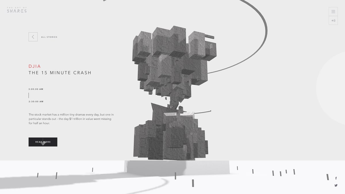
An interesting example of a 3D model created is “The 15-Minute Flash Crash”. This shows how Dow Jones (the stock market index indicating the value of publicly owned companies in the US) lost 9% of its value over just 15 minutes. The 3D model shows this as thin, sharp “protrusion” and represents the $1 trillion worth of stocks lost.
Sadly there’s no official option to download the models for personal use. However promotional imagery of what look to be SLS-printed examples show it’s a least possible to 3D print them.
Source: Press release
License: The text of "The Art of Shares Turns Stock Market Numbers into 3D Vizualizations and Prints" by All3DP is licensed under a Creative Commons Attribution 4.0 International License.